Operational KPIs in context
Average handling time, service-level percentage and customer satisfaction are presented as part of the same reporting picture.
A focused reporting view for contact-center operations, bringing handling time, service level and satisfaction metrics together.
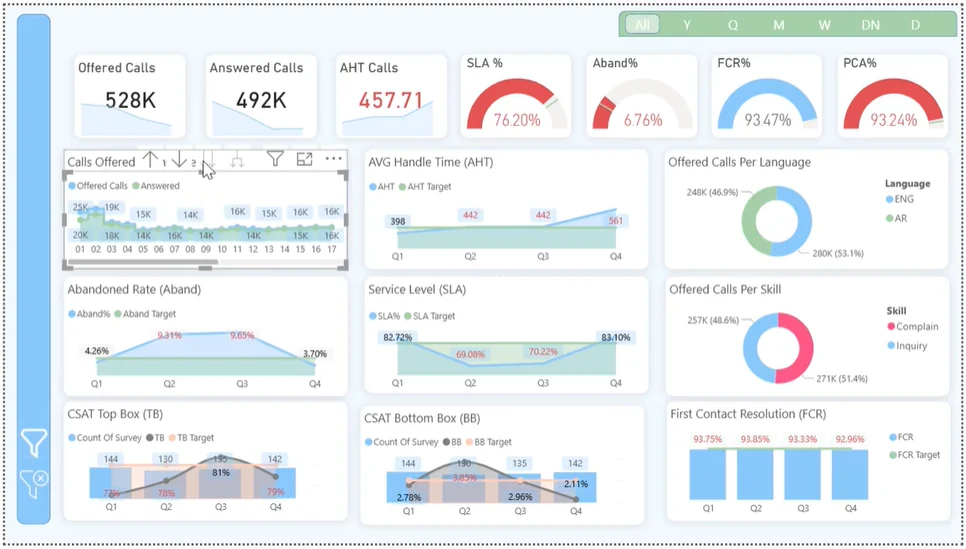
Contact-center teams have to read several indicators together. Handling time, service levels and customer satisfaction each describe a different part of the operation; reviewing them in isolation can hide the wider picture.
I brought the key operational indicators into a Power BI reporting view, using SQL and Excel in the reporting workflow. The layout supports a consistent daily review rather than a collection of disconnected reports.
Average handling time, service-level percentage and customer satisfaction are presented as part of the same reporting picture.
A consolidated dashboard gives operational stakeholders a common place to review performance.
The LinkedIn demonstration adds context to the static dashboard screenshot.
The dashboard organizes operational reporting around the indicators teams use in daily decisions, making it easier to review handling time, service levels and customer satisfaction together.
Open any screenshot to view it at full size.
See the report in action. Loading the walkthrough connects to LinkedIn.
UP NEXT / 04
HR People AnalyticsA new dashboard, a reporting bottleneck, or data that needs a clearer story. Tell me what you’re working on.
omarmagdy99860@gmail.comCairo, Egypt · Working remotely with clients worldwide
Looking for something similar for your business?
Discuss your project